Wi-Fi is about people. Introducing the new Wiman.
There is an amazing quote by Alvin Toffler that goes:
“Change is the process by which the future invades our lives”
Change is a process. The times in which change is instantaneous are rare. Even when it seems to be, it is actually highly likely the change has been progressing for some time and we did not notice it, we only realize things are changing when they invade us.
And that’s when we can do nothing but change, evolve.
This is the best way to describe what happened to Wiman in the last few months.
We can say there has been a transition from Social WiFi to WiFi Sharing or from hardware selling to providing a service, but there’s actually much more.
For us, it has been a real change in vision.
We realized a big change was happening in front of us: WiFi is not related to physical points anymore, it is related to people.
Once we acknowledged that, everything sort of fell into place: we became aware of the fact our biggest value is the community, and the new Wiman is all about the power of this incredible community.

We were one of the first companies to introduce the concept of Social WiFi however, this is a constantly and rapidly evolving sector and, nowadays, Social WiFi is not quite the amazing innovation it used to be three years ago.
So, we focused on the entire community rather than the single user. And once again, it is the community we want to give something disruptive.
When we realized WiFi is valued more by the users than by the provider, we did not have a single doubt: we had to move in a direction in which the user’s role would transform from passive to active, in line with the sharing economy.
This is how the new Wiman was born. How our App was born.

At that point, we understood we were holding a new vision, a new product but with an old image. An image that did not represent us anymore.
Every time we looked at the old logo we realized it did not represent the new Wiman anymore.

It did not represent our new vision.
In a moment of strong awareness just like the one just described, the rebranding process was natural and it was a process in which the whole team was involved.
All in all, the entire team was evolving.
Wiman was evolving.
Our creatives started working immediately to detect the weak points of the previous logo and come up with an original new one, which above all better represented of our new vision.
First, it was necessary to detect and summarize all the main concepts of the “Wiman universe”. It was all about putting onto paper an intuitive symbology as a starting point.
It was an incredible moment. We were working as a group, dynamically and collaboratively.
The process was long and characterized by a constant brainstorming and benchmarking activity, during which our creatives worked side by side with founders.
As it happens with brainstorming, we did several drafts and jotted down ideas for our new logo.

Everyone agreed that we should not use just WiFi waves, because it would have been trivial, and find a mix of non-abused, intuitive, strong and representative symbols.
And then, the magic happened.
Both our creatives and founders, observing the different drafts for the logo, realized they already had a winner. And, incredibly, it was the same for everyone.
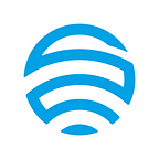
The perfect logo was the one which combined the WiFi symbol with the localization pin.

It perfectly represented our change of vision.
It is a logo that combines regular geometrical shapes that start from WiFi “waves” and flow into the localization pin. After numerous tests, this approach allowed us to obtain a unique and distinctive stroke.

When we focused on the textual part of the logo, we used the same approach. We gave the question a lot of thought, thinking about what font to use, creating several samples and realizing different combinations.
Not even a single test satisfied us.
It was inevitable: even this new aspect of the brand had to be customized.
It had to be unique.

We managed to obtain this uniqueness only by copying the same regular geometrical shapes of the logo, giving everything a sense of coherence and continuity.

The final confirmation of our choice arrived when we realized the iOS and Android icons of the app and tested the logo on a hypothetic merchandising of Wiman.
The results were amazing: we had a logo with a perfect mobile, web and “offline” applicability.


At that point, the evolution was complete: a new vision, a new app, a new logo.
A new Wiman.


Wiman App: bit.ly/wiMAN-Android
Website: www.wiman.me